|
|||||||||
| PREV PACKAGE NEXT PACKAGE | FRAMES NO FRAMES | ||||||||
See:
Description
| Interface Summary | |
|---|---|
| AdjustmentListener | Allows notification of Adjustment configuration or value changes. |
| DrawStyle | Provides drawing styles used by graphics and field objects. |
| FieldChangeListener | Listener interface for handling Field change events. |
| FocusChangeListener | Listener interface for handling changes in focus within fields. |
| RotationListener | Listener for rotation notifications. |
| ScreenUiEngineAttachedListener | Defines a listener for screen attach events. |
| ScrollChangeListener | Listener interface for handling scroll events in field managers. |
| UiEngine | Defines functionality for a user interface engine applications can use for their UI operations. |
| Class Summary | |
|---|---|
| AccessibleEventDispatcher | Accessible event dispatcher. |
| Adjustment | Abstract data structure used to establish a range of values and the step sizes contained within. |
| Color | Defines colors for convinience. |
| ContextMenu | A context menu that provides actions "appropriate" to the current field hierarchy. |
| ConvenienceKeyUtilities | A class used to programatically set an Application as the application to be launched upon a convenience key click. |
| DrawTextParam | Parameters used to control the drawing and measurement of text. |
| DrawTextParam.AdvancedDrawTextParam | Advanced text drawing parameters. |
| Field | Provides fundamental functionality for all field components. |
| Font | A font is a set of glyphs in a certain style and size, and an associated set of metrics describing their placement and overall size. |
| FontFamily | A font family is a collection of font faces (fonts of differing sizes and styles) which belong to the same typeface and are referred to by the same family name. |
| FontManager | FontManager handles loading and unloading of custom fonts for system-wide or application-specific use. |
| FontMetrics | The metrics of a font: that is, a typeface at a certain size and in a certain style. |
| FontSpec | FontSpec is a light weight class wrapping a few key Font parameters: font family, style, and height. |
| Graphics | Provides a surface on which applications can draw. |
| Keypad | Provides keypad functionality. |
| KeypadUtil | Provides keypad utility functionality. |
| Manager | Provides fundamental functionality for all field managers. |
| MenuItem | Represents an abstract menu item. |
| Screen | Base class for all screens. |
| ScrollView | This class provides fundamental scrolling functionality to all Managers. |
| TextMetrics | Metrics returned when drawing or measuring text. |
| TouchEvent | TouchEvent contains touch input events originating from the user that the application
uses when overriding Field.touchEvent(net.rim.device.api.ui.TouchEvent) for customizing touch
interaction behavior. |
| TouchGesture | TouchGesture represents a combination of basic touch input events originating from the user. |
| Touchscreen | Provides low-level access to the touchscreen on supported BlackBerry devices. |
| Trackball | Provides low-level access to trackball on supporting BlackBerry devices. |
| TransitionContext | The TransitionContext class contains all the necessary data to uniquely describe a transition animation between two screens. |
| Ui | Provides functionality and data global to the entire UI system. |
| UiApplication | Base class for all device applications that provide a user interface. |
| UiEngineInstance | User interface (UI) engine instance associated with an application or process, acquired by
calling Ui.getUiEngineInstance(). |
| VirtualKeyboard | For supported devices with touchscreens, the virtual keyboard allows the user to type using the display in either SureType or QWERTY keyboard mode (depending on device orientation). |
| XYDimension | Represents a dimension on a two dimensional, cartesian plane. |
| XYEdges | Used to describe padding, borders, and margins. |
| XYPoint | Represents a point on a two dimensional, cartesian plane. |
| XYRect | Represents a two dimensional rectangle. |
Provides fundamental functionality for constructing the user interface of a RIM Device application.
The members of this package are all abstract classes or interfaces and not
intended for direct instantiation. You should rather use (or extend) the
classes in
net.rim.device.api.ui.component and
net.rim.device.api.ui.container.
In our basic interface architecture, the three main UI primitives are
Field,
Manager, and
Screen. Fields represent rectangle areas that
can be drawn; managers contain fields (managers are fields themselves, so
they can be nested) and handle with layout and scrolling; screens are pushed
onto and popped off a UiApplication object's
display stack.
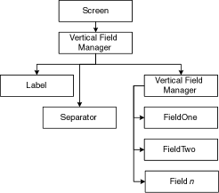
Each application presenting an interface to the user owns at least one screen object, which in turn manages a number of other objects. The nearby diagram demonstrates a simple example, and would be used by an application to present a long list of items to the device's user.
This application has one screen it presents to the user. The screen directly controls one, top-level vertical field manager (a special kind of field designed to manage and lay out a number of other fields, some of which may be field managers; the vertical field manager lays out its managed fields in a vertical list).
This particular screen's top-level field manager controls a label
field (used to contain the visible title for the screen), a
separator field (used to draw a line under the label title), and
another vertical field manager (which controls and lays out an arbitrarily
long list of field objects).
Designing applications for RIM devices, especially those with a user interface, is not the same as designing traditional UIs for desktop computing environments. In order to provide a useful interface consistent with other applications running on the device, we suggest you consider the following guidelines when using our UI system.
User Control
The user should always be in control of the application; here's principles to keep
in mind that help achive user control.
Intuitiveness
An interface should be as intuitive and straightforward as possible. One of
the best ways to achieve this is using the object-action paradigm. Users
select objects and perform actions on them (e.g., user selects a mail message
and reads it).
Consistency
Consistency should exist throughout each task in and between
applications. The onus is on you, as a developer, to have an awareness of
other applications being written for the device so that your application's
interface is a consistent part of the whole. Consistency also allows for the
reusability of common interface elements.
Likewise, block operations should be like the operations were done individually. This is especially important if an operation fails in the middle (eg. paste into a nearly full buffer).
Clarity
The interface should be clear, not only from a visual point of view, but also
from a conceptual point of view. Clarity is an especially important design
aspect because RIM Handhelds have small interfaces. If the
interface is jumpy (i.e., causes distractions by breaking visual flow), users
may have trouble maintaining control. If using icons, keep in mind that they
will be small and if they are cluttered, it will not be clear to the user how
the icon is related to the interface at hand. RIM Handheld applications are
not Windows applications! Do not fill the interface with a lot of
controls. Too many controls will only emphasize the small size of the
display.
Dialog and status boxes should contain brief and concise text. This text should not merely indicate to users what they have done incorrectly; they should also indicate what action is necessary to correct the problem.
Aesthetics
RIM devices are two-way wireless devices - they are not a desktop
solution. As such, device applications are not to be compared with Windows
applications. Three-dimensional graphics or flashing cursors on the device
display are inefficient and distracting. A simple design offers the best way
to ensure that RIM Handheld applications are aesthetically pleasing.
Keep the changing information on the display to one item, and keep the users' focus on one place at a time. When presenting a lot of information to users, ensure that the most important information is displayed first (e.g., when presenting each address book entry, display the name fields first, followed by the email address, phone, fax and pager numbers fields, and leave the Notes field to the end).
Another way the UI system keeps the RIM device aesthetically pleasing is by taking advantage of the vertical nature of navigation. Menu items and lists are all presented in a vertical fashion. Double-clicking (as opposed to 2 quick single clicks) is not desirable based on the size of the device and the input devices.
Feedback
Feedback is the application's response to users' input (e.g., the appearance
of a menu when users click or character display when users add
information to a field). Immediate feedback is essential and the application
should respond quickly to users' commands. For instance, one of the learning
curves for new users of the RIM Handheld will be typing on the
keyboard. Since keyboard typing may take a while to get used to, new users
could become frustrated quickly if feedback from typing or invoking
screens/dialogs/ menu is slow.
Forgiveness
The interface must allow users to change their mind and undo commands;
essentially, it must be forgiving two classic instances of keeping the
interface forgiving follow.
First, users cannot be allowed to do anything destructive without being warned (eg. an action such as deleting a message or address book entry must be confirmed before the action occurs). However, be careful with over prompting; this can cause users to start ignoring all prompts, which is possibly even worse than not prompting in the first place.
Second, common menu items are not close to others that undo the task at hand (eg. the Cancel menu item is not close to the Hide menu menu item).
Screen title
Every screen will have a title on the first line of the display. The title
line should be a repository not only to inform the users where they are, but
also to display brief information to help the users with the particular task
at hand. For example, when users perform a search in the address book
application, the screen's first line will display the screen title plus the
text typed to invoke a search.
Controls
Controls are tools such as icons and buttons that the user selects to issue
commands. Keep the number of controls on the display at any one time as small
as possible. Too many controls on the display will only emphasize the small
size of the display.
Keyboard and Trackball
As much as possible, try to keep the user from having to flip back and forth
between the keyboard and the trackball (if present). For example, if the user is entering
data using the keyboard, he should not have to use the trackball for some
form of input and then go back to using the keyboard.
The consequence of this is that most actions should be possible from both the keyboard and the trackball.
Quite often, users will overshoot with the trackball or accidentally click it while rolling. This has two ramifications:forgiveness principles should take this into account; menu items and dialogs should not be grouped in such a way to cause the user to accidentally do something destructive.
Errors
When encountering error conditions, the user should be informed without being
inconvinienced. Attempts should be made to make the failure graceful, that is
so that no information is lost. For example, if inserting in the middle of a
full field, it is better to not allow further input (and display a brief
error status message than to throw out characters at the end of the buffer
without warning.
|
|||||||||
| PREV PACKAGE NEXT PACKAGE | FRAMES NO FRAMES | ||||||||
Copyright 1999-2011 Research In Motion Limited. 295 Phillip Street, Waterloo, Ontario, Canada, N2L 3W8. All Rights Reserved.
Java is a trademark of Oracle America Inc. in the US and other countries.
Legal